 boswidget
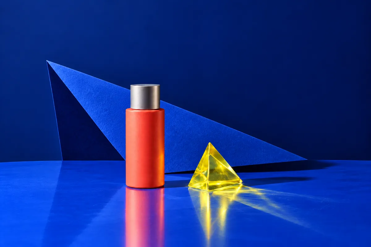
An attractive background can conceal a failed brief: the lamp sits behind the cloth, its handle becomes a separate object, or burgundy lands on the tray. Adding “detailed” and “professional” does not explain these relationships. For FLUX.2, start with an intelligible scene. This example builds a still life for a portable lamp product card.
Assign roles before describing a style
The image needs to show the lamp’s shape and the combination of painted metal and brass. The tray provides a pale compositional anchor; the cloth adds soft textural contrast. Neither should compete with the product. Giving each object a purpose helps remove detail: an object that explains nothing creates another condition to check.
- Main subject: a portable lamp with an opaque domed shade, a burgundy metal body #7A3348 and a curved brass handle. Body and handle belong to the same object.
- Left foreground: a small empty white ceramic tray, separate from the lamp. Its rim stays clear of the product’s base.
- Behind the lamp on the right: a folded linen napkin in #B7C4A8. Its fold and edge are visible, while the shade keeps a clear outline.
“On the left” and “behind” describe different axes: position across the frame and depth. Tie both to the main subject. “A napkin behind the lamp on the right” leaves less open than “a lamp, tray and napkin on a table”. Decide which contours must remain distinguishable before adding decorative details.
A complete prompt for this brief
The official FLUX.2 guide covers [pro] and [max]. A separate FAQ confirms that FLUX.2 does not support negative prompts. Describe the desired scene instead of building a prohibition list. A smooth body surface and an open background describe a restrained arrangement.
Product photograph of a portable table lamp. Main subject in the centre: an unlit lamp with an opaque domed shade and a burgundy metal body in #7A3348; a curved satin-brass handle is attached to the body. In the left foreground stands a small empty white ceramic tray, separated from the lamp base by a visible gap. Behind the lamp on the right lies a folded linen napkin in #B7C4A8; its edge stays below the shade. All objects rest on a matte light-grey surface. Soft external light through a large diffuser on the left, gentle shadows falling to the right. A broad soft highlight on the painted metal, a narrow muted reflection on the brass, and a visible weave in the cloth. Front view from slightly above. The entire lamp fits inside the frame and remains the main accent. Horizontal 3:2 composition with an open light-grey background.Substitute your product and materials while preserving clear relationships. Writing 3:2 in the description does not replace an output setting: check available dimensions and proportions in your chosen interface. The scene description explains the arrangement rather than specifying a fixed file size.
Change the cause of the problem
- If the tray touches the lamp base, change the geometry: “a strip of surface is visible between the tray rim and the lamp base”. Another light source will not fix that relationship.
- If the cloth obscures the lamp, change its position: “the napkin lies farther from the camera, its upper edge below the handle’s base”. Restore a clear silhouette before refining texture.
- If the handle looks plastic, specify the handle’s material and reflection. Applying “metallic” to the whole scene may instead give the cloth a hard, inappropriate shine.
- If the lamp disappears into its background, change one factor: background lightness or illumination on the body. Changing palette, viewpoint and layout together makes the comparison harder.
Keep the original prompt beside a note naming the edit and expected improvement. A geometry correction should produce a legible gap, not merely a nicer mood. Other details can change between runs, so inspect the complete frame again. Do not mentally carry a successful handle from one version into your judgement of another.
Check colour together with material
Attach each HEX code to its object. Here #7A3348 belongs to the body and #B7C4A8 to the napkin. Highlights, shadows and folds affect visible colour, so compare a broad illuminated area of the body with the reference rather than its brightest reflection. Also inspect the image at the size a customer will see.
Separate shape from texture. A convincing scratch cannot repair a handle attached at an implausible angle. Examine the shade, base and connection points first. Then ask whether satin brass, painted metal, glazed ceramic and linen read as different materials. Identical gloss across all surfaces weakens that distinction, even when the palette itself looks appealing.
Choose an image against visible criteria
- Silhouette: the whole lamp is visible, its handle connects to the body and its supports look stable. Inspect small joints at a larger scale too.
- Layout: the tray sits left and forward; the napkin sits right and behind. Overlaps preserve a readable main subject.
- Light: shadow direction is coherent. An accidental glow from the unlit lamp should not replace the intended external illumination.
- Colour and texture: burgundy stays on the body and sage on the cloth; ceramic reads differently from metal, linen differently from moulded plastic.
Choose for the product card’s purpose, not just visual drama. Expressive fabric is little help if the customer cannot read the lamp’s shape. If spatial relationships keep falling apart, simplify temporarily: retain the lamp and tray, then restore the cloth with its position specified.
To generate an image with your prepared prompt, open the FLUX page below. Before starting, check the selected model version and set the image proportions.
Keep the final prompt, selected image and correction notes together. That record of decisions helps with the next product more than generic adjectives. When shape or material changes, recheck roles, reflections and overlaps.